
3. Usage Statistics
To better understand how the PATH2Go applications were used, the evaluation team planned to collect usage data for each of the applications and worked closely with the project team to determine the best method for tracking usage. Because of the complicated server structure that provides information to all three applications, collecting usage statistics for each of the applications individually proved difficult. Additionally, separating usage data for registered users versus anonymous users was also a challenge.
Despite the difficulties, the project team was able to establish tracking logs for each of the servers that provide information to the PATH2Go applications. The logs developed by PATH were useful for tracking the number of registered users as well as identifying the general usage the applications. In addition to the tracking logs, the project team also used a web analytics tool called Google AnalyticsTM to track usage of the PATH2Go Trip Planner and PATH2go Web Based Traveler Information applications specifically. As mentioned in the Background section, the two applications are hosted on the same website and are accessible from each other despite providing different information. Therefore, the data collected by Google Analytics provides usage information for all visits to either website application by both registered users and anonymous users together.
Although the PATH2Go applications were officially launched on July 29, 2010, not all usage information was available immediately. The number of registered users and number of anonymous user sessions for the PATH2Go applications were tracked from the beginning, but additional server logs and Google Analytics tracking were not implemented until mid-August 2010. The server logs developed by PATH were primarily used to identify the total number of registered users and to assess the general usage of the PATH2Go Smart Phone Application.
The Google Analytics data provided the opportunity to analyze more detailed usage information for the two website applications and was collected from mid-August to mid-November 2010, when the evaluation period came to an end. Google Analytics provides data on the frequency of visits, looking at whether users were returning or new to the website, and looking at where the majority of web traffic was originating. This information supplements the other evaluation activities in determining how frequently the website applications are used and by what audiences. Some of the specific measures available in the website analytics tracker include:
- Visitor frequency.
- Visitor type (i.e., new vs. returning).
- Visitor location.
- Visitor trending (e.g., page views, time on site, total visits).
- Visitor loyalty (e.g., recency, length of visit, loyalty).
All of these measures are available by day or over any specified time period, allowing for an in-depth analysis of website usage. With the wide variety of metrics available on Google AnalyticsTM, the evaluation team was able to perform specific analyses that are important to evaluating usage of a website.
In the sections below, the evaluation team presents a high-level analysis of usage statistics for the PATH2Go Smart Phone Applications using the server logs provided by PATH and a more detailed analysis of the usage statistics for the PATH2Go Trip Planner and PATH2Go Web Based Traveler Information website applications together using data collected with Google Analytics. Both sets of analyses allowed the evaluation team to identify the user base, observe how usage was affected by targeted marketing efforts, and capture user characteristics for the all of the PATH2Go applications.
3.1 APPLICATIONS LAUNCH
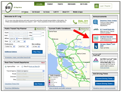
As mentioned in the Background chapter, the PATH2Go applications were officially launched on July 29, 2010 on MTC's 511 website.8 The 511 website is a very popular and well-known source for detailed travel and transportation information in the San Francisco Bay Area. Over a million users visit the website each day. The applications were advertised on the homepage of the website with an advertisement link (identified with the red arrow in Figure 3-1 below) for four to five weeks through August and into September 2010. In addition to the advertisement on Announcements section of the homepage, the application was also temporarily available on the Traffic page of the website and permanently added to the list of third party applications featured on the Mobile & Apps page. The link provided on the 511 website led users to the Networked Traveler project website which provided background information on each application.
Figure 3-1. PATH2Go applications Launch on MTC 511 Website, July 29, 2010.
Although the MTC advertisement served as the primary launch for all three PATH2Go applications, the PATH2Go Smart Phone Application was also launched into the respective app markets for the iPhone and Android versions of the application separately. Titled PATH2Go, the iPhone app was released into the Apple iTunes App Store just prior to the primary launch on July 20, 2010. The Networked Traveler project website was available at the time in preparation for the MTC launch, so iPhone owners could technically download the iPhone app and register as users before the test's official launch. Also titled PATH2Go, the Android app was released into Google's Android Marketplace around September 6, 2010. The Windows Mobile version of the application was only available for download from the Networked Traveler project website, so it was launched with the MTC advertisement. Users could choose between having a link to the application download sent to their smart phone via text message or they could navigate to the Networked Traveler project website via their smart phone web browser to click on a link and download the application.
Although efforts to increase awareness of the PATH2Go applications were on-going, the evaluation team began collecting usage statistics as soon as they became available. It is important to note that the evaluation period is defined as July 29, 2010 through November 15, 2010, or from when the applications were officially launched until the evaluation ended.
3.2 USER BASE
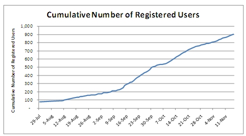
Knowing the total number of users who have accessed the PATH2Go applications is an important factor in evaluation. This information helped determine the expected sample size for user survey activities, and has helped provide insight into the level of exposure that the PATH2Go applications received. The first metric considered was the total number of registered users. As mentioned before, the server logs developed by PATH helped tracked the total number of registered users throughout the evaluation period. Figure 3-2 below shows the growth in registered users throughout the evaluation period, which includes users from all three applications. Again, users who wanted to use the PATH2Go Smart Phone Application were required to register while users accessing the PATH2Go Trip Planner and PATH2Go Web Based Traveler Information website could do so anonymously or logged in as a registered user. Therefore, the number of registered users in the figure below contains all smart phone application users, but may also include users who registered but only used the website applications and does not show users who used either website application but did not register. As of November 15, 2010, there were a total of 905 registered users for the PATH2Go applications.
Figure 3-2. Cumulative Number of Registered Users, July 29, 2010 – November 15, 2010.
3.2.1 PATH2Go Smart Phone Application
Next, the evaluation team was able to use the tracking logs provided by PATH to determine how many of the total registered users had downloaded and opened the PATH2Go Smart Phone Application at least once. Using tracking code that recorded requests sent from the smart phone to the server each time a user started the smart phone application, the evaluation team determined that 602 of the 905 registered users, or 67 percent, had downloaded and opened the smart phone application at least once. Figure 3-3 below presents the total number of users that opened the PATH2Go Smart Phone Application each day. Please note that this tracking information was only available from August 23, 2010 – November 2, 2010, which is a subset of the evaluation period. Therefore, any calculations made for the PATH2Go Smart Phone Application usage using these tracking logs are conservative.
Figure 3-3. Total Number of PATH2Go Smart Phone Application Users per Day, August 23, 2010 – November 2, 2010.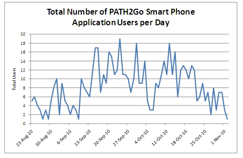
Further calculations were made to better understand how often users were opening the smart phone application. The average total number of times a user opened the application on their smart phone was 6.16 times. Interestingly, 202 of the 602 smart phone applications users, or 34 percent, only opened the application one time. However, according to research presented in a February 2009 InformationWeek article on Apple App Store downloads,9 this trend can be expected for smart phone application downloads.
According to the research conducted by an iPhone application analytics firm called Pinch Media, "most people stop using iPhone applications downloaded from Apple's App Store after the first day." After monitoring more than 300 million downloads, the firm found that only 20 percent of users downloading free apps and 30 percent of users downloading paid apps were using the applications the next day. With 66 percent of users returning for more than one use, the PATH2Go Smart Phone Application seems to have successfully captured user attention. In fact, when one-time users are excluded, the average total number of times a user opened the smart phone application rises to 8.76 times.
It is important to note that the accuracy of the methodology used to determine the number of one-time smart phone application users is dependent on the type of smart phone. The numbers presented above are conservative and represent the highest number of one-time users possible based on the server logs. Some smart phones including the iPhone 4 and certain Android models have functionality that keeps applications running in the background when a user navigates to another app versus exiting the application completely. For this reason, it is possible that some of the 202 users who were recorded as one-time users could have used the application several times during a single session where as other smart phone models would have opened and closed the app several times showing multiple sessions.
3.2.2 PATH2Go Website Applications
By taking the difference in total registered users and those who downloaded the smart phone application and opened it at least once, the evaluation team observed that 303 of the registered users, or 33 percent, only used one or both of the PATH2Go website applications. While the number of registered users using the website applications only is now known, it is possible that all or some of the users who downloaded the smart phone application could have also used the website applications logged in as a registered user or anonymously. Therefore, Google Analytics was used to gain further insight into usage of the website applications by registered users and anonymous users together. Again, it is important to note that the PATH2Go Trip Planner and PATH2Go Web Based Traveler Information are hosted on the same website. Google Analytics cannot distinguish between the use of each application, so the analysis includes usage of both applications together.
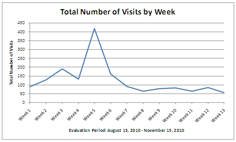
There are two metrics available in Google AnalyticsTM which are important to distinguish between when analyzing website usage: visits and visitors. The number of visits is an indication of the general usage of a website, as in how many times the content is viewed in total, where as the number of visitors is an indication of how many individuals are using the website. A single visitor could account for multiple visits after using the website more than once. Figure 3-4 shows the website usage by total number of visits per week from the website's launch through the end of the evaluation period in November 2010.
Figure 3-4. Total Number of Website Visits by Week, August 15, 2010 – November 15, 2010.
It is important to realize that a large number of visits does not necessarily translate to a large number of visitors and vice versa. The number of visits is an indicator of how much the website is being used, while the number of visitors is an indicator of how many people are using the website. The relationship between visits and visitors can provide insight into how frequently visitors are using the website, which will be addressed specifically in the discussion of website user characteristics later in this chapter. The total number of individuals who have visited the website one or more times, or visitors, is the metric used to determine the website user base. Google AnalyticsTM determines the user base by measuring absolute unique visitors. This metric uses first party cookies stored on a user's computer to determine if he/she has visited the website previously within a specified time period. It is important to consider the possibility of error in this metric as web browsers generally allow users to delete or disable cookies if they would like (i.e., if a user deletes his/her cookies before returning to the website again, he/she will be marked as an absolute unique visitor on his/her next visit). However, as long as users have not deleted their cookies at any point over the time span of using the website, they will be recognized as a returning visitor for up to 2 years and only counted once as an absolute unique visitor over the website life cycle.
Figure 3-5 shows how the website user base has grown over time from when the PATH2Go Applications were first launched at the end of July 2010 through the end of the evaluation period in November 2010. Apparent in both Figure 3 4 above and Figure 3 5 below, the number of users visiting the website experienced a significant increase in early September. Possible explanations for the sharp increase in visits and visitors will be addressed in the next section of this chapter.
Figure 3-5. Cumulative Number of Absolute Unique Visitors by Week, August 2010 – November 15, 2010.
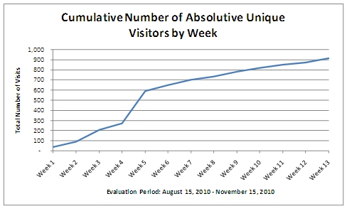
As of November 15, 2010, a total of 916 absolute unique visitors made up the PATH2Go website applications user base, accounting for 1,664 total visits to the website, and an average of 1.82 visits per user.
3.3 TARGETED MARKETING EFFORTS
A discussion of the PATH2Go applications user base and how it has grown over time transitions well into the topic of how website usage was affected by targeted marketing efforts put forth by the project team. Exploring what events may have caused the various spikes in usage of the PATH2Go applications provides additional insight into the user experience. It also addresses the public need for and use of the applications aside from what can be learned from survey activities. In addition to analyzing usage statistics, the evaluation team actively monitored outreach efforts put forth by the project team and any corresponding media coverage or website posts where the PATH2Go applications were mentioned or advertised. By looking at the response to marketing efforts put forth by the PATH team, lessons learned can be compiled about what efforts are most effective in "spreading the word" about real-time traveler information tools like the PATH2Go applications.
3.3.1 Impact of Direct Marketing on Usage
The project team took several strides to market the PATH2Go applications to Bay Area travelers, beginning with its launch on the MTC 511 website on July 29, 2010. Additionally, there were three other major marketing efforts coordinated by the project team. First, PATH worked with the communications staff at the UC Berkeley Institute of Transportation Studies (ITS) to prepare and distribute a press release explaining the research that produced the PATH2Go applications. The press release was distributed on August 31, 2010 and immediately received the attention of several local and regional media outlets over the following days. Although there were over 900 hits on the press release website and several questions from major media outlets, local Berkeley news outlets including the student-run newspaper and UC Berkeley news center and several transit/transportation websites and blogs were the primary sources of coverage resulting from the press release.
The usage data collected for the PATH2Go website applications using Google Analytics was the best source for insight into the impact of the press release and corresponding media coverage. Figure 3 6 below shows website usage in number of visits by day. There is a clear increase in visits to the website applications beginning on the day the press release was distributed. The full press release is available in Appendix C. In addition to collecting usage statistics, the evaluation team also recorded a detailed list of the specific media coverage and internet sources that referenced or mentioned the PATH2Go applications. This list is provided in Appendix D.
Figure 3-6. Website Usage in Visits by Day, August 15, 2010 – September 3, 2010.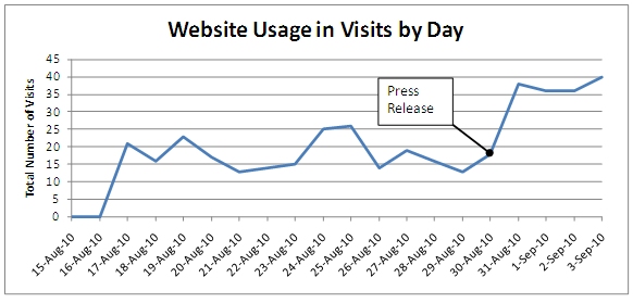
From the beginning of September through early October 2010, the PATH team added another targeted marketing effort by distributing flyers two or more times per week at various transit stations covered by the PATH2Go applications. With the permission of several transit agencies, PATH staff stood on transit platforms and at bus stops handing out flyers to increase awareness of the applications from the beginning of September 2010 through early October 2010. The flyer developed by PATH is available in Appendix E.
Because it provided background information for each three PATH2Go applications, the press release and flyer developed by PATH as well as the MTC launch all advertised a link to the Networked Traveler project website10 as shown in the Appendices. The Google Analytics data presented above was for the website applications only. The evaluation team also had access to usage data using Google Analytics for the Networked Traveler project website. Because that was the link advertised in these three major marketing efforts, the usage data for the project website provides additional insight into the impact of the press release on awareness of the PATH2Go applications. Figure 3-7 below presents the website usage in number of visits by day for the Networked Traveler project website throughout the entire evaluation period. The figure shows an even more drastic increase in website usage on the project website compared to the actual website hosting the PATH2Go website applications. In fact, the number of visits to the project website almost reached 100 in the days following the press release while usage of the website applications did not exceed 40 visits. This indicates that a number of website visitors responding to the media coverage viewed the project background information, but did not continue on to try or use the website applications. This is a possible indicator of usefulness. The other various bumps and spikes in visits to the project website through early October can likely be attributed to PATH's efforts in distributing flyers at transit stations to market the applications. However, without the actual dates that flyers were distributed, this cannot be stated with any certainty.
Figure 3-7. Networked Traveler Project Website – Usage in Visits by Day, August 15, 2010 – September 3, 2010.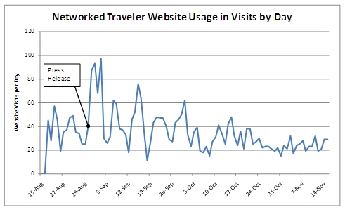
PATH coordinated one last targeted marketing effort using the social media website, TwitterTM. The project team posted a "tweet" to the "followers" of caltrain Twitter account, which allows Caltrain riders that use Twitter to post and/or receive delay information or service updates as they are happening through the account,11 which enjoys the attention of over 5,000 followers. On September 15, 2010, the project team posted a link directing users to the specific Caltrain real-time schedule and parking information available on the PATH2Go Web Based Traveler Information website. Figure 3-8 below shows the tweet posted by PATH on the caltrain Twitter page as well as a few examples of normal tweets posted on the account.
Figure 3-8. Twitter Post on Caltrain Twitter page.

The usage data collected using Google Analytics was able to capture the impact of this effort. Figure 3 9 below shows the staggering increase in website usage resulting from the Twitter post. In fact, website usage prior to the tweet and through the remainder of the evaluation period after the tweet pales in comparison to the number of website visits on the days immediately following the caltrain tweet. The website traffic generated by the Twitter post increased the total number of absolute unique visitors by 104 percent and the total number of visits by 66 percent in the span of five days.
The figure below also shows website usage for the entire evaluation period. Figure 3 9 actually presents the same information as Figure 3 4 in the User Base section above. However, the figure below uses a different collection period interval (by day instead of by week) and clearly paints a different picture. The increased definition in the graph clearly shows how the targeted marketing efforts, which can occur on a single day or over successive days, significantly affected website usage. From the perspective of the entire evaluation period, usage increased initially but fluctuated after the targeted marketing efforts of preparing a press release and distributing flyers at transit stations. While this increased the size of the user base, usage of the PATH2Go website applications experienced a staggering increase after social media was used as a marketing tool.
Figure 3-9. Website Usage in Visits by Day, August 15, 2010 – November 15, 2010.
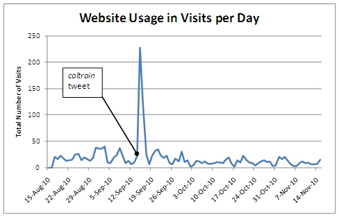
These observations suggest that newer, more progressive forms of marketing like using social media websites such as Twitter can be significantly more effective in increasing awareness of real-time traveler information like the PATH2Go applications. However, it is important to point out that using social media without a focus may not be as effective. The significant increase in website usage is likely the result of targeting a specific group on Twitter with a vested interest in the type of information provided by the PATH2Go applications.
Although still effective, it seems that more traditional forms of marketing like preparing a press release cannot generate the same level of exposure as quickly as a targeted social media effort without being covered by a major media source.
Overall, usage seemed to settle into somewhat of steady up and down pattern after the initial marketing efforts put forth by the project team. Then, the response to a tweet on the caltrain Twitter account clearly had a major impact on usage. However, the impact was short-lived as usage quickly returned to its rolling pattern of approximately five to thirty website visits per day. While social media may have a greater ability than traditional marketing to attract a large number of visitors to a website quickly, the usefulness of or need for the information available on a website is generally what drives return visits.
3.4 USER CHARACTERISTICS
In addition to determining the user base and exploring what establishes and drives usage, it is equally important to observe the general characteristics and actions of users in regard to the use of the PATH2Go applications. While some of this analysis was presented in the user base section above for the PATH2Go Smart Phone Application, Google Analytics provides detailed usage statistics that offer insight into user behavior when accessing a website. This analysis provides insight into the visitors' use of the website such as frequency by which they visit, the means by which they access the website, and the general geographic location of website users. Although this section will focus primarily on user characteristics related to the PATH2Go website applications, it will also provide insight into how users became aware of the PATH2Go applications as a whole. User characteristics for the PATH2Go website applications were available for August 15, 2010 through November 15, 2010 using Google Analytics.
3.4.1 Trends in User Frequency
Determining how frequent visitors use the website is as important to the evaluation as knowing the size of the user base. The following metrics show what percentage of users only visit the website one time versus those who return for additional visits. These measures can serve as key indicators in understanding how useful the website appears to be or how often the users have a need for this type of information. Google Analytics breaks down visitor frequency into two different metrics: "loyalty" and "recency."
Visitor loyalty provides a useful assessment of how often users are returning to the website relative to the evaluation period. Figure 3-10 shows that approximately 45 percent of website users returned to the website for additional visits following their first visit.
Figure 3-10. Visitor Loyalty, August 15, 2010 – November 15, 2010.
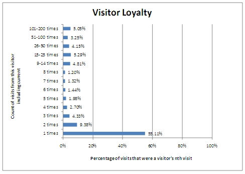
Visitor loyalty can be an indicator of user acceptance and need for a website, but it is difficult to infer why more than half of first-time website users did not return for another visit. Figure 3 10 also confirms what Figure 3 9 above shows. The large number of visits generated by the caltrain tweet was short lived and did not result in a consistent level of usage from that point forward. A wide variety of factors could contribute to this trend. Possible reasons include:
- Length of Evaluation Period and Frequency of Travel on Transit. It is also possible that a large number of website users travel on transit only a handful of times per year and only access the website when needed. Many users may not have had a need for repeat use of the website within the evaluation period of three months.
- Usefulness of Real-time Information. Some users may solely use the website to identify their transit options. Despite the fact that the website provides real-time schedule and trip planning information, users may not find a need to return to the website after identifying the best mode and route for their trip. It seems intuitive that frequent transit riders or commuters would be more interested in the real-time information but may have less of a need for trip planning capabilities while infrequent transit riders may have equal or less interest in the real-time information but more interest in the trip planning capabilities. Real-time information may not be as important to transit riders who are not waiting at transit stops/stations or affected by transit delays as often. Another possibility is that users were looking for information about a specific transit route or parking lot that was not covered by the website and did not return because that information was not available.
- Perceived Value of Website. It is possible a large number of initial visitors could have accessed the website quickly in response to any of the targeted marketing efforts for a preview of what information was available on the website, but did not initially find it to be useful enough to warrant a return visit. It is important to note that these one-time visitors are still considered to be part of the website user base.
- Website Functionality. First-time visitors may have had problems with website functionality or difficulty using the website and elected not to return for an additional visit.
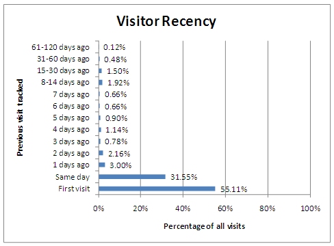
Figure 3-11 provides additional insight into visitor frequency by showing visitor recency, or how many days typically go by before visitors return for subsequent visits. It is important to note that only the most recent user behavior is recorded in the visitor recency metric. These measurements are all correlated to when the user last visited the website. For example, a user who visited the website for the first time on Day 1, but then did not return to the website until Day 7, would be included in the "6 days ago" category for visitor recency measured on Day 7. However, if this same user returned on Day 8 and visitor recency was recorded on Day 9, the user would then be included in the "1 days ago" category. Therefore, the measure of recency is always relative to when recency is recorded, which is November 15, 2010 for the figure below.
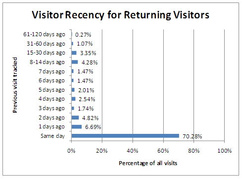
As Figure 3-10 indicated and Figure 3 11 confirms, over 55 percent of users have only visited the website one time. However, Figure 3 12 below only includes the previous visits tracked for return visits to the website (i.e., the first visit category was removed and percentages were calculated based on the remaining categories). Relative to November 15, 2010, Figure 3-12 shows that over 70 percent of visits by return visitors to the website were made within the same day as their last visit. Although no conclusions can be drawn about what percentage of website users are represented in this figure because of the significant difference between visits and visitors, it does show that often times return users visit the website more than once a day. This trend suggests that users who have used the website more than once prefer to view the information presented on the website several times in one day in order to make the best use of it, which seems intuitive to real-time information.
Figure 3-11. Visitor Recency, August 15, 2010 – November 15, 2010.
3.4.2 Trends in Website Visits
There are several Google Analytics metrics that provide a snapshot of the typical user visit to the website. The analyses below give insight into typical user behavior as well as how website visitors generally use the information it provides. Figure 3-13 displays the total number of visits to the website by time of day. Overall, the highest usage is seen at 3:00pm and 6:00pm with a significant peak occurring at 4:00pm. Although steady usage occurs throughout the morning and into the early afternoon hours, website usage doubles at the 4 o'clock hour. This trend suggests that on the whole users find the information available on the website most valuable during the early afternoon rush hour, 3:00pm – 5:00pm.
Figure 3-13. Website Usage in Visits by Time of Day, August 15, 2010 – November 15, 2010.
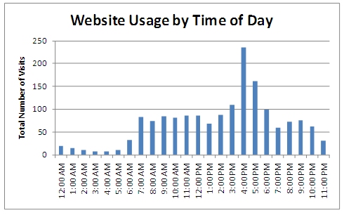
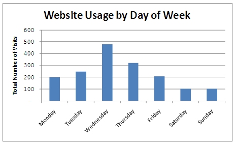
Figure 3-14 displays the total number of visits to the website by day of the week. Wednesday and Thursday account for the greatest number of visits to the website, which suggests traveler information is most useful in the mid to late work week.
Figure 3-14. Website Usage in Visits by Day of Week, August 15, 2010 – November 15, 2010.
Another important metric to consider when analyzing website user characteristics is the amount of time users spend on the website. Figure 3-15 shows user length of visit, or how long users generally stay on the website when they visit. This figure suggests that users are spending very little time on the website when they are visiting, but it is important to understand how Google Analytics calculates this information before drawing this conclusion. This metric is actually recorded relative to the number of pages a user views while visiting the website. The program records the time when a user first arrives on the webpage and can only determine the length of visit when the user actually visits another page on the website or exits the webpage. It calculates the length of visit by finding the difference between the timestamp on the new page visited and the initial timestamp recorded on the original page visited. Because of this, a user must visit more than one page in order for a true length of visit to be recorded. Another indicator of how long visitors spend on the website is the average time on site calculated throughout the evaluation period, which was 2 minute and 12 seconds.
Figure 3-15. Length of Visit, August 15, 2010 – November 15, 2010.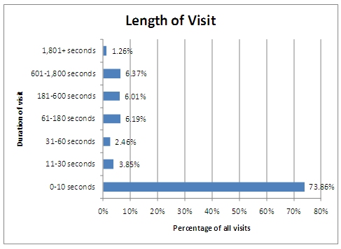
3.4.3 Trends in Accessing the Website
Another important factor to analyze when considering the functionality of a website is how users arrive to the website in the first place. Source websites can be identified by looking at the breakdown in number of visits by traffic source, or essentially what outlet visitors are using to arrive at the website. Figure 3 16 below shows the percentage of visits associated with each type of traffic source. Trends in the way users access the website provide insight into how most users are finding the website in the first place. With 73 percent of users traveling to the website from a referring site, the remainder of the user traffic arrives by typing in the exact URL or using a bookmark in their browser (27 percent) or by typing keywords into a search engine (0.06 percent).
Figure 3-16. Types of Traffic Sources by Number of Visits, August 15, 2010 – November 15, 2010.
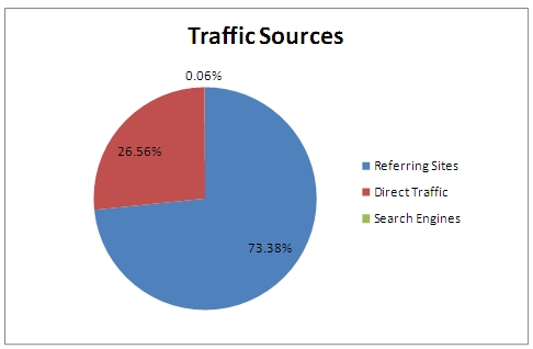
Table 3-1 below provides insight into which sources visitors are using to arrive to the PATH2Go website applications. As expected, the majority of visitors find their way to the website applications from the Networked Traveler project website. As mentioned above, the 27 percent of traffic that linked directly to the website can likely be attributed to visitors who have bookmarked the exact website URL. Social media, primarily Twitter, was the source of the remaining visits at slightly less than 15 percent.
| Sources | Number of Visits | Percent |
|---|---|---|
| Referring site – networkedtraveler.org | 962 | 57.81% |
| Direct Traffic | 442 | 26.56% |
| Referring site – twitter.com | 175 | 10.52% |
| Referring site – mobile.twitter.com | 68 | 4.09% |
| Referring site – facebook.com | 4 | 0.24% |
Because the Networked Traveler project website was the primary traffic source for the PATH2Go website applications and was the website advertised for the MTC launch, press release, and flyer distribution, the Google Analytics traffic source data for the project website can provide additional insight into how users heard about the PATH2Go applications as a whole. Figure 3 17 below shows the percentage of visits associated with each type of traffic source for the project website. With almost 55 percent of users traveling to the website directly, the remainder of the user traffic arrived from a site with a link to the project website (36 percent) or by typing keywords into a search engine (9.36 percent).
Figure 3-17. Networked Traveler Project Website – Types of Traffic Sources by Number of Visits, August 15, 2010 – November 15, 2010.
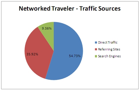
Table 3-2 below provides insight into which sources visitors led users to the project website. While the majority of visits come from users typing in the URL directly or having it bookmarked, the remaining lists shows a number of sources that can be directly attributed to the targeted marketing efforts. All of the 511.org sources are likely the result of the test launch on the MTC 511 website. Nearly all of the media outlets that covered the press release and are listed in Appendix D are accounted for in the table below. It is also possible that some of the direct traffic can be attributed to the flyers handed out by PATH staff.
Table 3-2. Networked Traveler Project Website – Traffic Sources by Number of Visits, August 15, 2010 – November 15, 2010.| Sources | Number of Visits | Percent |
|---|---|---|
| Direct Traffic | 1,766 | 54.73% |
| Referring Site – 511.org | 482 | 14.94% |
| Search Engine – google.com | 283 | 8.77% |
| Referring Site – tlab.path.berkeley.edu | 122 | 3.78% |
| Referring Site – its.berkeley.edu | 115 | 3.56% |
| Referring Site – traffic.511.org | 110 | 3.41% |
| Referring Site – path.berkeley.edu | 98 | 3.04% |
| Referring Site – my511.org | 44 | 1.36% |
| Referring Site – tlab.path.berkeley.edu:8080 | 34 | 1.05% |
| Referring Site – americancity.org | 21 | 0.65% |
| Search Engine – yahoo.com | 16 | 0.50% |
| Referring Site – thetransitwire.com | 14 | 0.43% |
| Referring Site – facebook.com | 13 | 0.40% |
| Referring Site – aashtojournal.org | 12 | 0.37% |
| Referring Site – losangelestransportation.blogspot.com | 12 | 0.37% |
| Referring Site – dot.ca.gov | 11 | 0.34% |
| Referring Site – itunes.apple.com | 11 | 0.34% |
| Referring Site – traffictechnologytoday.com | 10 | 0.31% |
| Referring Site – masstransitmag.com | 7 | 0.22% |
3.4.4 Trends in Geographic Location of Users
Figure 3-18 and Figure 3-19 display the geographic location of website visitors based on their locations recorded in Google AnalyticsTM, which are determined using visitor IP addresses. In regard to user privacy, it is important to note that the tool does not provide a list of IP addresses; it simply provides a city name and a State name for each visit to the website. The maps below represent density relative to website visits, which again is different from visitors. It is important to note that the densest areas on the map represent where the most use occurs, not necessarily where the most website visitors live.
After retrieving the list of cities from Google AnalyticsTM, the evaluation team used the number of visits per city to create density maps, which group all cities into their corresponding areas. Figure 3 18 displays the website traffic across the entire country using a scale of circle size as an indicator of density. As shown in the figure, the website received national exposure with website users from all over the United States. While the PATH2Go applications provides information that is primarily for travelers in the San Francisco Bay Area, the additional usage from areas around the countries can likely be attributed to either out-of-town travelers that find the information useful or researchers or practitioners interested in learning more about the PATH2Go applications. Figure 3 19 provides show website usage in the Bay Area. As expected, the most usage occurred in the areas along and surrounding US-101 corridor. Of the website visits in the Bay Area, San Francisco, Redwood City, Berkeley, San Jose, and Oakland accounted for the most website visits.
Figure 3-18. National Website Usage by City Density, August 15, 2010 – November 15, 2010.
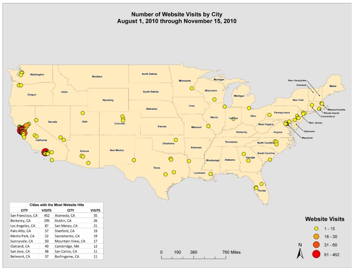
Image courtesy of SAIC.
Figure 3-19. Bay Area Website Traffic by City Density, August 15, 2010 – November 15, 2010.
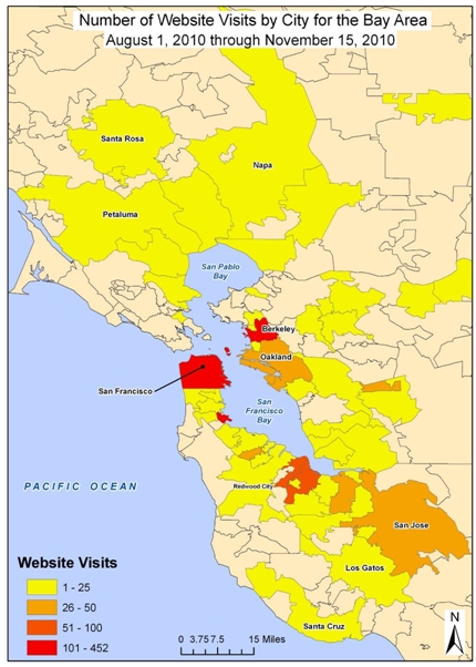
Heat map courtesy of SAIC.
3.5 SUMMARY
In summary, the PATH2Go applications experienced steady growth in registered users throughout the evaluation period while daily use of the PATH2Go Smart Phone Application and the PATH2Go website applications fluctuated throughout the evaluation period. The initial targeted marketing efforts of advertising the applications on the MTC 511 website, distributing a press release, and handing out flyers at transit stops/stations were effective in attracting registered users and increasing awareness of the website applications. The most significant increase in usage of the website applications came as the result of a Twitter post on a popular account followed by transit riders that use Caltrain. The website traffic generated by the Twitter post increased the total number of absolute unique visitors by 104 percent and the total number of visits by 66 percent in the span of five days.
Over the course of the evaluation period, which began with the launch on July 29, 2010 and ended November 15, 2010, the PATH2Go applications attracted over 900 registered users, 67 percent of which downloaded and used the smart phone application at least once and may have also used the website applications. 34 percent of the smart phone application users downloaded the app and only opened it once without returning; leaving 66 percent that used it more than once. 33 percent of users registered on the project website, but only used the website applications. By the end of the evaluation period, the PATH2Go website applications attracted a total of 916 absolute unique visitors that accounted for 1,664 total visits to the website, and an average of 1.82 visits per user.
The usage analysis suggests that newer, more progressive forms of marketing like using social media websites such as Twitter can be significantly more effective in increasing awareness of real-time traveler information like the PATH2Go applications. Although still effective, more traditional forms of marketing like preparing a press release do not seem to generate the same level of exposure as quickly as a targeted social media effort without being covered by a major media source. Although the fluctuating website usage was greatly increased using Twitter, the impact was short-lived as usage quickly returned to its rolling pattern of approximately five to thirty website visits per day only a few days after the caltrain tweet. While social media may have a greater ability than traditional marketing to attract a large number of visitors to a website quickly, the usefulness of or need for the information available on a website is generally what drives return visits.
Website user characteristics provided insight into typical user behavior when accessing the PATH2Go applications. Trends in user frequency, trends in website visits, trends in accessing the website, and finally trends in the geographic location of users all provided valuable insight into the specific characteristics of the user base for the PATH2Go website applications. With over 55 percent of users having only visited the website one time, regular or return users of the website were not as common. User frequency can often be an indicator of user acceptance and need for a website, but a number of factors may explain why less than half of website users returned for another visit. Possible explanations for this trend include:
- Length of Evaluation Period.
- User Travel Frequency using Transit.
- Usefulness of Real-time Information.
- Perceived Value of Website.
- Website Functionality.
There is no definitive way to determine which of these explanations is responsible for the greater number of one-time users versus return users. Regardless, a low visit frequency does not necessarily indicate low user acceptance or usefulness, but may more so be an indicator of how visitors use the information on the website.
Trends in the time of day and day of the week that users access the website suggest that the information is most useful during the early afternoon rush hour, 3:00pm – 5:00pm, and the latter half of the work week, on Wednesdays and Thursday.
Trends in the way that users accessed the website provide insight into how it is that users came across the website in the first place. The usage analysis shows that the Networked Traveler project website, direct traffic to the site, and Twitter were the top traffic sources for the website applications. Because the Networked Traveler project website was the primary source for the PATH2Go website applications and was the website advertised for the MTC launch, press release, and flyer distribution, trends in the way users accessed the project website provided additional insight. While the majority of visits to the project website came directly, the results of the targeted marketing efforts were apparent in the list of traffic sources responsible for the most visits. The MTC 511 website as well as several of the media outlets that covered the press release were traffic sources for users visiting the Networked Traveler project website.
Lastly, trends in geographic location of users were assessed using density maps showing website visits in cities across the country. A view of the map from a national perspective showed that usage expanded to several different parts of the United States. The national exposure suggests that out-of-town travelers used the information or researchers and practitioners from around the country were interested in the PATH2Go applications. A second maps view provides a greater level of detail for the cities in the San Francisco Bay Area. As expected, the majority of website visits originated along or around the US-101 Corridor. San Francisco, Redwood City, and Berkeley accounted for the most website visits.
8 Link to the MTC 511 website: http://www.511.org/ [ Return to note 8. ]
9 Gonsalves, Antone. "Apple App Store Downloads Often Abandoned." InformationWeek. InformationWeek Business Technology Network. 20 Feb. 2009. Web. 6 Dec 2010. Link to article: http://www.informationweek.com/news/personal_tech/iphone/showArticle.jhtml?articleID=214502225 [ Return to note 9. ]
10 Link advertised for the Networked Traveler project website: www.networkedtraveler.org [ Return to note 10. ]
11 Link to the caltrain Twitter page, which includes instructions on how to post a "tweet": http://twitter.com/#!/caltrain [ Return to note 11. ]