
4. User Perceptions
The evaluation team developed and conducted a web-based user survey to collect feedback from actual users of the PATH2Go applications. It is important to note that users were required to register in order to download the Smart Phone Application, but could use either of the web-based tools anonymously or as registered users. The evaluation team elected to only survey registered users in order to comply with the UC Berkeley CHPS guidelines established to protect users' privacy. The PATH team managed all registered users' personal information collected during the registration survey (including e-mail address), so that the evaluation team did not have to access or request any user contact information.
4.1 PURPOSE
The specific evaluation objective addressed by the web-based user survey was to analyze users' perceived accuracy and usefulness of the suite of PATH2Go applications. Specifically, the survey was designed to:
- Identify usage characteristics (e.g., applications used, frequency of use, etc.).
- Identify perceived usefulness and accuracy of PATH2Go applications.
- Determine users' opinions regarding the functionality and usability of the PATH2Go applications.
- Identify respondent travel behavior (e.g., primary mode of transportation, personal vehicle access, trip purpose, transit use, etc.)
- Identify respondent demographics (e.g., gender, age)
The purpose of the survey was to gather overall impressions that registered users had of the Path2Go applications, their impression of its overall utility for transit trip planning, and to gather specific information about the applications' features on a number of dimensions. While use of the Trip Planner website, Traveler Information website, and Smart Phone Application were recorded individually, the majority of survey items explored user perceptions of all three PATH2Go applications as a set, so the results represent, for the most part, global perceptions of the applications, not reactions to each individual tool. The survey included additional questions aimed at collecting user perceptions specific to the Smart Phone Application, its use, and the geo-fencing functionality implemented to prevent distracted driving.
4.2 SURVEY APPROACH
The evaluation team worked closely with PATH project team regarding possible options for surveying registered users. Initially, the teams decided on e-mailing all registered users to request their participation in the survey. The evaluation team developed an initial e-mail and a set of reminder e-mails, which PATH sent to registered users on its behalf. PATH also generously offered to extend the 100 dollar monthly drawing incentive offered on their own user survey to registered users who participated in the evaluation team survey. The survey was launched on October 11, 2010 when the first e-mail was sent to registered users (see Figure 4-1 below).
Figure 4-1. Initial E-mail to Registered Users Requesting Survey Participation, October 11, 2010|
Good Morning, Thank you for registering for the Networked Traveler project. We are contacting you with a unique opportunity to provide more detailed feedback about your experience with the PATH2Go applications and to get your thoughts regarding transit information provided by the smart phone and website applications. Your anonymous responses will be part of a National Report on traveler information technology like the PATH2Go applications. Your responses could help shape whether or not this information is provided elsewhere throughout the country. If you would like to participate in this unique opportunity, please click on the link below and answer our short survey about your experience with the PATH2Go applications: Please click here to take the survey. The survey should not take more than 5 minutes of your time. As a thank you for your time, you will have the opportunity to enter a drawing for one of three $100 gift cards upon completing the survey. Your responses are very important to us, and we look forward to hearing from you. |
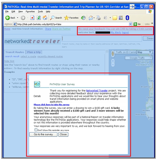
The evaluation team closely monitored the response rate following the initial e-mail and follow-up e-mails were sent when the number of survey responses declined. A total of four reminder e-mails were sent to only registered users who had not responded to the survey. As the survey response rate declined from the initial spike of the survey launch, the evaluation team and project team began discussing additional ways to attract registered users to the survey. On November 1, the PATH project team added a link to the survey on both the Trip Planner website and the Traveler Information website that was only available when registered users were logged into the website. Additionally, they also implemented a pop-up box on both websites that appeared when registered users navigated to the site. Figure 4-2 below is screen shot of the Traveler Information website that provides a visual of both the text link and pop-up link to the user survey (see red boxes).
The survey was closed on November 15, 2010.
Figure 4-2. Pop-up and Text Links to User Survey on PATH2Go Traveler Information website
The survey was designed to be completed quickly, so that it was straightforward and low burden. It was comprised primarily of multiple choice/check boxes with a few opportunities for free response. While users were taking the survey, there was a progress bar along the top of the page showing the percent complete to give respondents feedback on where they are in the survey and to encourage them to continue through to the end. For both recruitment methods, only registered users were exposed to the user survey.
The evaluation team collected 108 completed surveys and 13 partial surveys for a total of 121 user surveys. Figure 4-3 below presents the survey sample size and the results of the survey recruitment efforts. As shown below, the recruitment efforts clearly had an impact on the response rate. The most surveys were collected on days where an e-mail was sent to registered users requesting their participation in the survey. The numbered stars in Figure 4-3 are placed on the dates when an e-mail was sent while the blank star marks the date that the pop-up and text link were designed into the website tools. It appears that the e-mails to registered users were the most effective recruitment method although the pop-up and text link did seem to engage a few additional respondents.
Figure 4-3. PATH2Go Web-Based User Survey Responses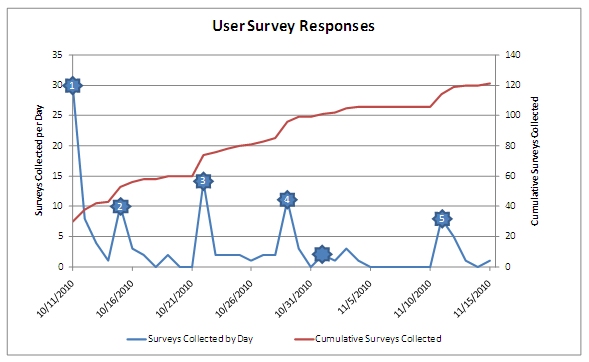
The total number of registered users increased during the survey period from 571 when the survey was launched on October 11 to 905 when the survey was closed on November 15, 2010. It is important to note that the 5 times PATH sent an e-mail to registered users, up to 200 messages were returned due to invalid e-mail addresses. Although the user base (population) ranged from 571 – 905 throughout the survey period, a number of registered users were not exposed to the user survey since not all received the e-mail. For this reason, it is difficult to calculate the actual survey response rate (i.e., the user population increased during the data collection period which would provide a response rate range of 19 percent to 12 percent. Finally, the survey sample is considered self-selected because registered users could opt whether or not to participate in the survey. Users had the option to ignore the pop-up text on the website and could choose to disregard the text link or the survey link provided in the e-mail messages. Therefore, the results of the survey should be viewed as descriptive analysis of their perceptions, not as a statistically valid sample, though their perceptions do offer valuable insights into the design and performance of the applications.
4.3 SUMMARY OF RESPONDENT CHARACTERISTICS
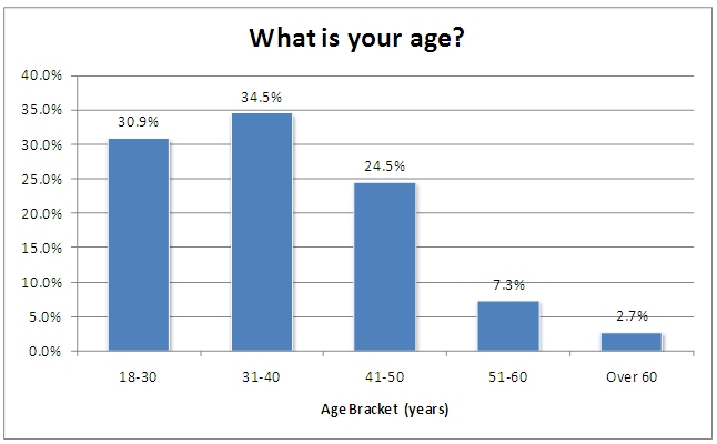
Survey respondents were asked to supply general information regarding their typical commuting behaviors, age, and gender. Figures 4-4 and 4-5 show the age groups and gender of the respondents. As shown, the majority of the group was male and approximately one-third were in the 18-30 and 31-40 year old age groups. One-fourth was in the 41-50 year old group and about 10% were over 50 years old. The proportions of males and females in each age group were roughly similar.
Figure 4-4. Respondent Gender
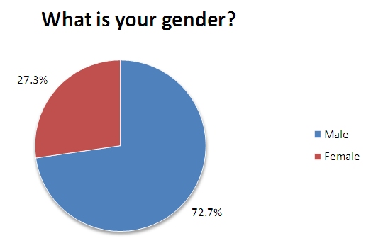
Figure 4-5. Respondent Age Group
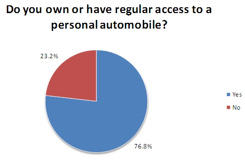
Respondents also indicated whether or not they had regular access to a personal automobile, which could, ostensibly be used for their daily commutes. As shown in Figure 4-6, more than three-fourths of the respondents did have access.
Figure 4-6. Respondents' Access to a Personal Automobile
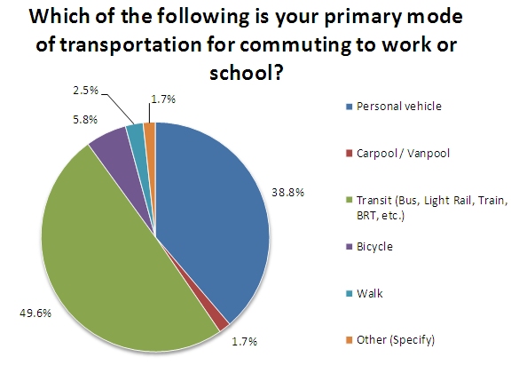
However, while a high proportion did, almost half of respondents reported they used transit as their primary mode for commuting (Figure 4-7). Only slightly more than one-third reported they relied on their personal vehicles for their commutes and approximately one in ten either walk, cycle, or use carpools or vanpools.
Figure 4-7. Respondents' Primary Mode for Commuting
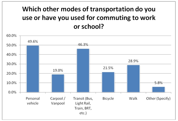
When queried about other modes of transportation they might use for commuting (where respondents could choose more than one option), approximately one-half reported either using a personal vehicle or using transit. It would appear alternative transportation modes for commuters show similar proportions using a personal vehicle or transit (Figure 4-8). A high proportion of respondents also indicated using bicycles, carpools/van pools, or walking as alternatives.
Figure 4-8. Respondents' Other Transportation Modes for Their Commute
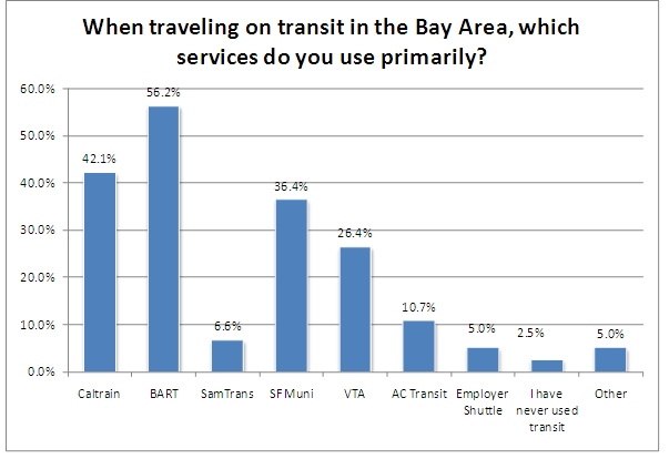
For those who do use transit, the primary services they use is represented in Figure 4-9. Again, they could choose multiple transit services and their choices reflect both where they live and where they work, as discussed earlier, primarily along Route 101. A high proportion of respondents have identified BART, CalTrain, SFMuni, and VTA as the most used transit systems (as would be expected based on daily commute origins and destinations).
Figure 4-9. Primary Transit Services Used in the Bay Area
4.4 USE OF THE APPLICATIONS/WEBSITE
This section focuses on the respondents' usage patterns for the applications that were available to users, including the Path2Go Trip Planner website, the Path2Go Travel Information website, and the Smart Phone application.
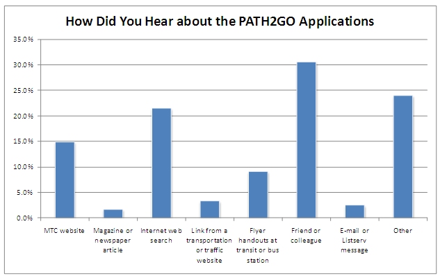
As shown in Figure 4-10, most (46 percent) heard about the applications from web-based sources; either from a web search, the MTC website, a link from a transportation or traffic website, or a message received via email or listserv. The single most cited source was a friend or colleague (31%). And, about one-fourth reported "other"; these included such sources as Craigslist, but also included "having heard about the application from the Itunes store" and almost one-half who chose "other" reported they heard about it from the "Android Market."Figure 4-10. Sources Where Respondents Heard About the Path2Go Applications
As discussed earlier, there was some concern about asking for respondents' usage patterns, especially since those who used the iPhone applications would have had a longer usage period when compared to the Android-based application, due to its relatively late "roll out." Therefore, to attempt to equalize the usage, users were asked how often they had used the applications in the "past week."
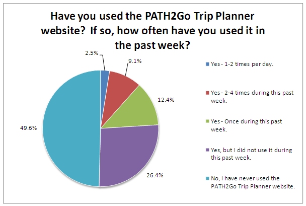
As shown in Figure 4-11, approximately half of the users said they had never used the PATH2GO trip planner and another fourth had used it, but not in the past week.
Figure 4-11. Use of the Path2Go Trip Planner Website
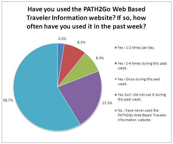
When considering use of the PATH2GO Traveler Information site (Figure 4-12), a similar pattern was also evident, though a higher proportion of all users reported they had never used the site (58.7 percent) or had not used it in the past week (22.3 percent).
Figure 4-12. Use of the Path2Go Traveler Information Website
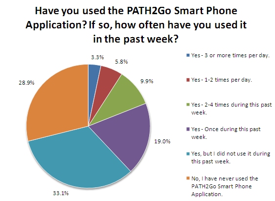
For those respondents who downloaded the Smart Phone application (Figure 4-13), usage frequency is different to that for the website, though the sample size of users represented is somewhat less (n=86). Just over one-fourth reported they had never used it, even after the application was downloaded; almost three-fourths of the respondents had used it, and over one-third had used it multiple times in the past week.
Figure 4-13. Use of the Path2Go Smart Phone Application
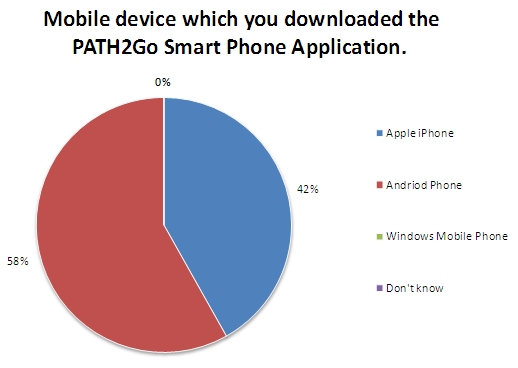
As shown on Figure 4-14, users identified only the Apple iPhone and the Android Phone as the mobile devices users reported for the application. More of the users reported having the Android phone (58%) than the Apple iPhone.
Figure 4-14. Mobile Device Used for the Smart Phone Application
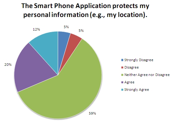
When queried about whether the application protects their personal information (e.g., their location), the majority of users (59%) reported they "neither agreed nor disagreed" with the statement (Figure 4-15). Interestingly, approximately one-third either "agreed" or "strongly agreed" with this statement while only 10 percent "disagreed" or "strongly disagreed." Responses by device type were very similar across all response categories, indicating that regardless of the device used, respondents did not feel that the application compromised their personal information.
Figure 4-15. Respondents' Perceptions of the Smart Phone Application's Protection of Personal Information
Respondents were also queried regarding whether or not they received the warning message informing them that the device was disabled while they were driving. As shown in Figure 4-16, exactly half of the respondents reported receiving the message and one-half did not.
Figure 4-16. Respondents' Perceptions of Having Received the Disabled Warning While Using the Smart Phone Application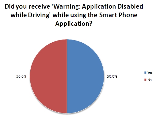
As shown in Table 4-1, the proportion of iPhone and Android users showed slightly different experiences with receiving the message; 56 percent of iPhone users reported they received the message compared to 46 percent of the Android users.
| Received Message? | iPhone Device | Android Device |
|---|---|---|
| Yes | 56% | 45% |
| scope="row"No | 44% | 54% |
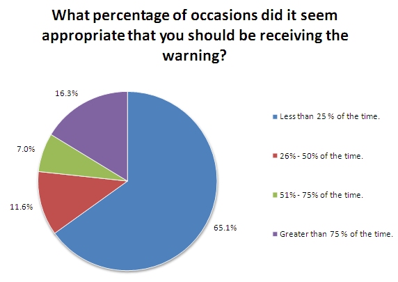
As shown in Figure 4-17, almost two-thirds of the respondents felt that they received inappropriate warnings very infrequently, i.e., less than 25 percent of the time. Of note is that slightly over 16 percent perceived the warnings were inappropriate more than 75 percent of the time. In addition, the proportion of those who responded in this manner was consistent across both mobile devices. To help explain these findings, a number of similar comments were offered by the respondents. Many felt that they had received the warning while traveling on the different transit vehicles or as passengers in a car, while planning their trips.
Figure 4-17. Respondents' Perceptions on the Appropriateness of the Warning Message Received
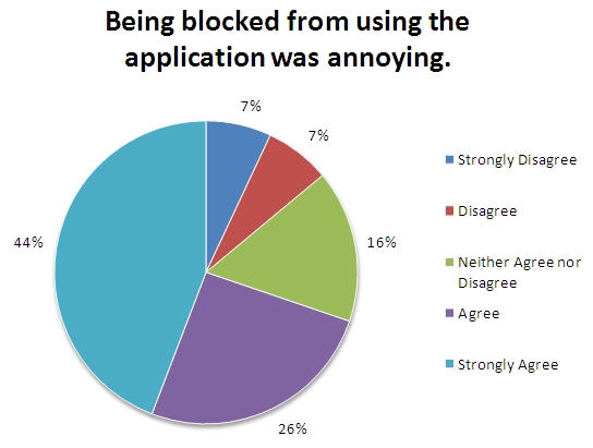
However, while most did not perceive the proportion of time being blocked very highly, when asked about the degree of annoyance they experienced (Figure 4-18), 70 percent of respondents reported they "strongly agreed" or "agreed" that being blocked was annoying. Again, this level of annoyance may have been due to a combination of the users' understanding of how (and when) the application would be operable as well as to the effectiveness of the geo-fencing process.
Figure 4-18. Respondents' Perceptions on the Level of Annoyance of the Application Being Blocked
In fact, when looking at responses by device used, it appeared that iPhone users were more annoyed than the Android users (Table 4-2).
| "Being blocked was annoying" | iPhone | Android |
|---|---|---|
| Strongly Disagree / Disagree | 15% | 13% |
| Neither Agree nor Disagree | 5% | 26% |
| Strongly Agree / Agree | 80% | 61% |
4.5 TRIP PLANNING USING THE PATH2GO APPLICATIONS
This section summarizes respondents' experiences and use of the PATH2Go applications (including both the websites as well as the downloadable Smart Phone application). It includes a discussion of the reasons for the use as well as users' perceptions of various aspects of the applications.
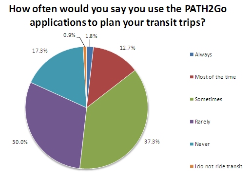
As shown in Figure 4-19, while respondents had reported using the applications, approximately one-half reported they "never" or "rarely" used the applications to plan their transit trips. An almost equal proportion reported they used the applications "sometimes" or "most of the time."
Figure 4-19. Frequency of Using PATH2Go Applications for Planning Transit Trips
When considering the types of trips that the applications were used for, as shown in Figure 4-20, it would appear that just over one-half of the trips were for regular commutes – either to one's work or job or to school. Since these are typically regular trips where respondents may travel the same routes at the same times, it may help explain the relatively low usage patterns of the applications. If the respondents are regular commuters, they may know their routes and, if using transit, may be very familiar with the road conditions and/or transit schedules. However, approximately one-half of the trip purposes may be considered non-routine – such as going shopping, running errands, or visiting family or friends. In these cases, respondents may need to search out the relevant information from the applications to help them plan the trips.
Figure 4-20. Purpose of Trips When Using the PATH2Go Applications
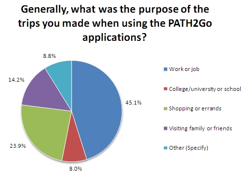
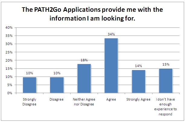
Figure 4-21 summarizes respondents' views on how well the applications provided them with the information they needed to plan their trips. As shown, almost one-half "strongly agreed" or "agreed" that the applications did provide them with the information they were looking for. Conversely, only 20 percent "strongly disagreed" or "disagreed" that the information was available. Finally, 18 percent reported they were neutral on this attribute. It would appear, therefore, that most users felt the applications did have the information they needed or wanted.
Figure 4-21. Respondents' Perceptions – Applications Provided them with Information They Were Seeking
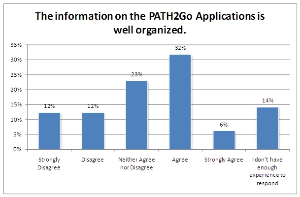
However, as shown in Figures 4-22 and 4-23, while respondents said the applications had the information, they did not feel that the information was well presented or organized. An almost equal proportion of respondents "strongly agreed" or "agreed" that the information was well presented (35 percent) or was well organized (38 percent). Similar proportions "strongly disagreed" or "disagreed" that the information was well presented (31 percent) and well organized (24 percent). These findings are represented in comments received where respondents reported either they found the information they were looking for "but it took a long time – especially when I was first using the application" or "I gave up trying to find the schedules because I got lost in the site."
Figure 4-22. Respondents' Perceptions – Applications' Presentation
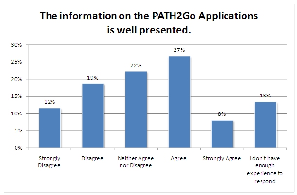
Figure 4-23. Respondents' Perceptions – Applications' Organization
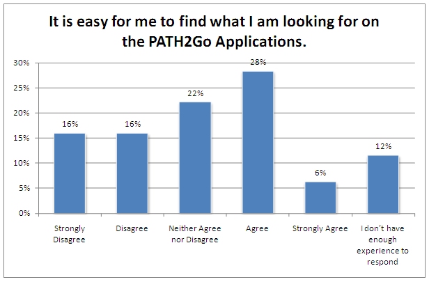
These comments were also reflected in their perceptions of the ease at which the respondents could find the information they were seeking (Figure 4-24). Similar proportions were obtained from respondents; approximately one-third "strongly agreed" or "agreed" that it was easy for them to find the information and an almost equal proportion "strongly disagreed" or "disagreed."
Figure 4-24. Respondents' Perceptions – How Easy to Find Information on Applications
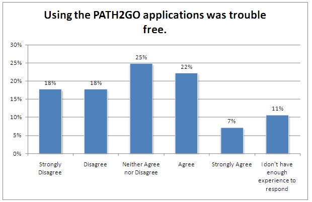
Perhaps respondents' perceptions of the use of the application are best summarized in Figure 4-25. As shown, less than one-third "strongly agreed" or "agreed" that the applications were trouble free. Very few, in fact, strongly agreed that the applications were trouble free. Over one-third "strongly disagreed" or "disagreed" they were trouble free; in fact one in six strongly disagreed – indicating, perhaps that some of the users were disappointed in how the applications functioned.
Figure 4-25. Respondents' Perceptions – Application was Trouble Free
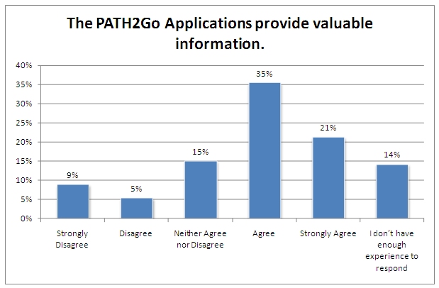
However, while the users may have not perceived the applications as providing well presented, organized, or trouble free information, as shown in Figure 4-26, they did perceive the information as valuable. Well over half of respondents "strongly agreed" or "agreed" that the information was valuable and this is contrasted with only 14 percent who "strongly disagreed" or "disagreed." Therefore, while searching for the information on the applications may have been somewhat frustrating, respondents did see the value in having the information.
Figure 4-26. Respondent Perceptions – Applications Provide Valuable Information
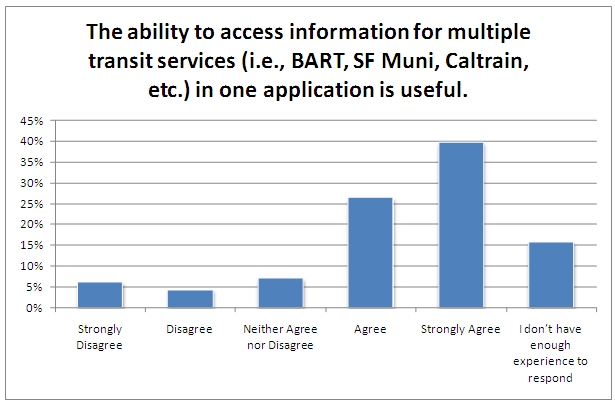
In fact, when using the applications, respondents felt that having information for multiple transit services was very useful (Figure 4-27). Almost two-thirds "strongly agreed" or "agreed" that supplying information for multiple services (e.g., Caltrain, BART, SF Muni) was very helpful. This was especially true for those trips that were non-routine and may have involved multiple services or services they normally did not use.
Figure 4-27. Respondents' Perceptions – Application Information for Multiple Transit Services
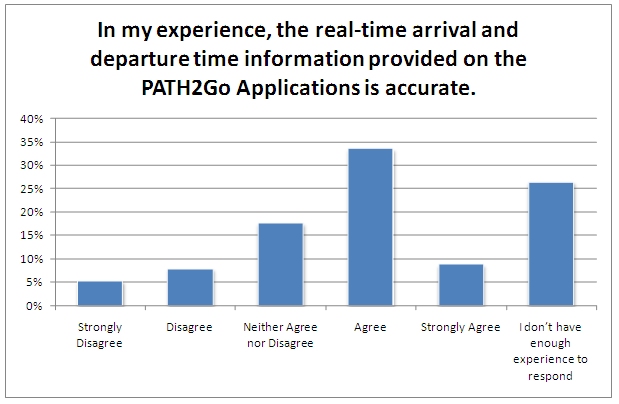
Additionally, there was relatively strong agreement from respondents that the real-time departure and arrival information supplied on the application was valid (Figure 4-28). While one-fourth reported they did not have enough experience to rate this, 40 percent reported they "strongly agreed' or "agreed" that the schedule information was reliable. Only 12 percent "strongly disagreed" or "disagreed" that the information was reliable.
Figure 4-28. Respondents' Perceptions – Reliability of Real-time Arrival and Departure Information
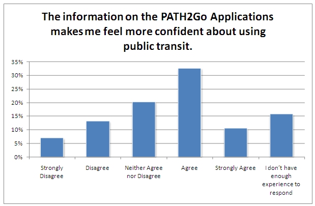
These previous perceptions are reflected in the respondents' feelings of confidence about using transit (Figure 4-29). As shown in this figure, slightly over 40 percent reported they "strongly agreed" or "agreed" that the information on the applications would make them feel more confident about using transit. Conversely, less than 20 percent had opposite perceptions.
Figure 4-29. Respondents' Perceptions – Applications Make Them More Confident About Using Transit
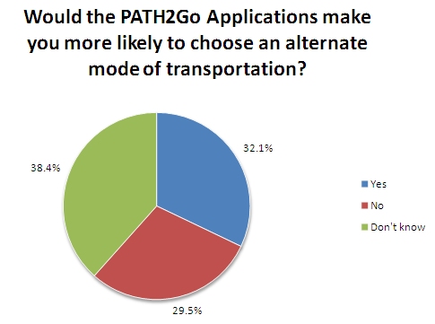
While, however, they may feel more confident, as shown in Figure 4-30, using the applications would only influence about one-third to choose an alternate transportation mode. A slightly lower proportion reported they would not choose another mode while 38 percent were unsure. Since approximately half report they currently use transit and a similar proportion report using a private automobile, it cannot be said for certain if drivers would consider using transit, based on these results, though one may surmise that there is a higher probability of drivers shifting to transit than transit riders shifting to driving their vehicles.
Figure 4-30. Respondents' Perceptions – Would Applications Influence Transportation Mode
As shown in Figure 4-31, respondents overwhelmingly reported they would not change their intended routes based on the information available on the applications. It would appear, perhaps, that the information provided by the applications (Trip Planning, Traveler Information, and SmartPhone application) would not satisfy users' needs for considering different routes.
Figure 4-31. Respondents' Perceptions – Application Influence on Intended Route
4.6 SUGGESTIONS FOR MAKING THE APPLICATION BETTER
Respondents were asked to suggest how to make the applications better. Slightly less than one-half supplied comments, which could be grouped into two general categories – performance and design.
In terms of design, representative comments seemed to focus on the ability to get to the needed information efficiently, especially for routine (daily commute) information. Representative comments included:
- "The iPhone app layout is also quite confusing... Logging in every time I use this app is annoying."
- "Put color coded agencies on the TOP of the first screen, don't make us click to get there. Include ALL transit agencies covered by 511..."
- "It is way too hard to use and very confusing [about] what's going on. I should be able to save common trips."
In addition to the design issues, many also mentioned the applications' performance, focusing primarily on the mobile devices, and specifically on the geo-fencing function. Representative comments included:
- "The web application is a little bit slow to be useful"
- "I installed the [Smart Phone] application and tried to use it once or twice but found it a bit slow and clunky."
- "The 'Application Disabled while Driving' [message] is a problem when I'm using transit (either a bus or train) and either want to track the trip I'm currently on or want to plan a trip after the one I'm on."
- "The app assumed I was driving and prevented me from using it for periods. I was on the train, not driving! Bad assumption."
- "Today I tried to use the app while on the VTA tram to see the schedule since I was running late; it told me not to use it while I was driving and denied me access!"
While many of the users are aware of the applications' limitations, they also indicated that they understand the applications are relatively new and appreciate their utility, as reflected in these comments:
- "While I don't have a phone that supports the app and commute mostly by bicycle, I do encourage you to go on – this is a very important initiative."
- "Wasn't able to enter a destination address to get directions... very confusing. But liked having easy and quick access to the schedules."
- "I've only had a limited opportunity to evaluate it, but it looks promising."
4.7 SUMMARY
Registered users were asked to provide feedback on the applications beginning in October 11, 2010 through November 15, 2010. A total of 121 surveys were received from registered users. This sample is considered a convenience sample and is not considered to be representative of all users, therefore, the analyses conducted and presented here is a descriptive summary of the responses received. Based on the information gathered, the respondents were predominantly male and most were in the 18 to 40 year old age group. Approximately one-half reported their primary mode of transportation was transit and 40 percent reported they used a personal automobile or carpool/van pool. When asked how they heard about the applications, most reported a web-based source (e.g., a web search, the MTC website, a link from another transportation site, or from an electronic message). A high proportion, 30 percent, reported they heard it from a friend or colleague, which further indicates the importance of informing the public with "word of mouth" methods, especially as it comes from trusted sources.
Recent usage of the applications (within one week of completing the survey) showed relatively low usage patterns, especially for the web-based applications. At least one-half of respondents reported never having used the Trip Planner or Traveler Information site and approximately one-fourth had not used either site in the week before completing the survey. Use of the Smart Phone application was slightly higher with only approximately one-half of respondents reporting they had never used it or had not used it in the past week. One-half of the respondents reported they use the applications to plan their transit trips and these are for regular trips (e.g., commuting to work or school).
For those who had used the Smart Phone application, 58 percent had downloaded it to an Android device and 42 percent to an iPhone. One-half of the users reported having received the "Warning: Application Disabled While Driving" message, though two-thirds of those who got the warning reported that it occurred relatively infrequently – less than 25 percent of the time. However, when it was received it was reported as annoying by 70 percent of users. This observation was borne out by respondent comments that focused on trying to use the application while riding on transit vehicles or as passengers in automobiles and "being blocked." Annoyance levels were slightly higher for those with iPhones when compared to Android users.
When considering the attributes and value of all three applications, users were generally pleased with them though, there were areas where the applications could be improved such as retrieving the information. For instance, approximately one-third reported the applications were not trouble free; it was not easy to find the information they were looking for; and the information was not well presented. However, one-half of respondents reported the applications provided them with the information they were looking for and slightly more than half reported that the information on the applications is valuable. Almost 40 percent also reported the information is well organized. There was also strong agreement that the ability to access multiple transit services and having reliable arrival and departure information was important. Finally, most respondents reported that having the transit information available to them made them more confident about using transit, though there was not overwhelming evidence that having this information would lead to them choosing an alternative mode to their usual transportation method.